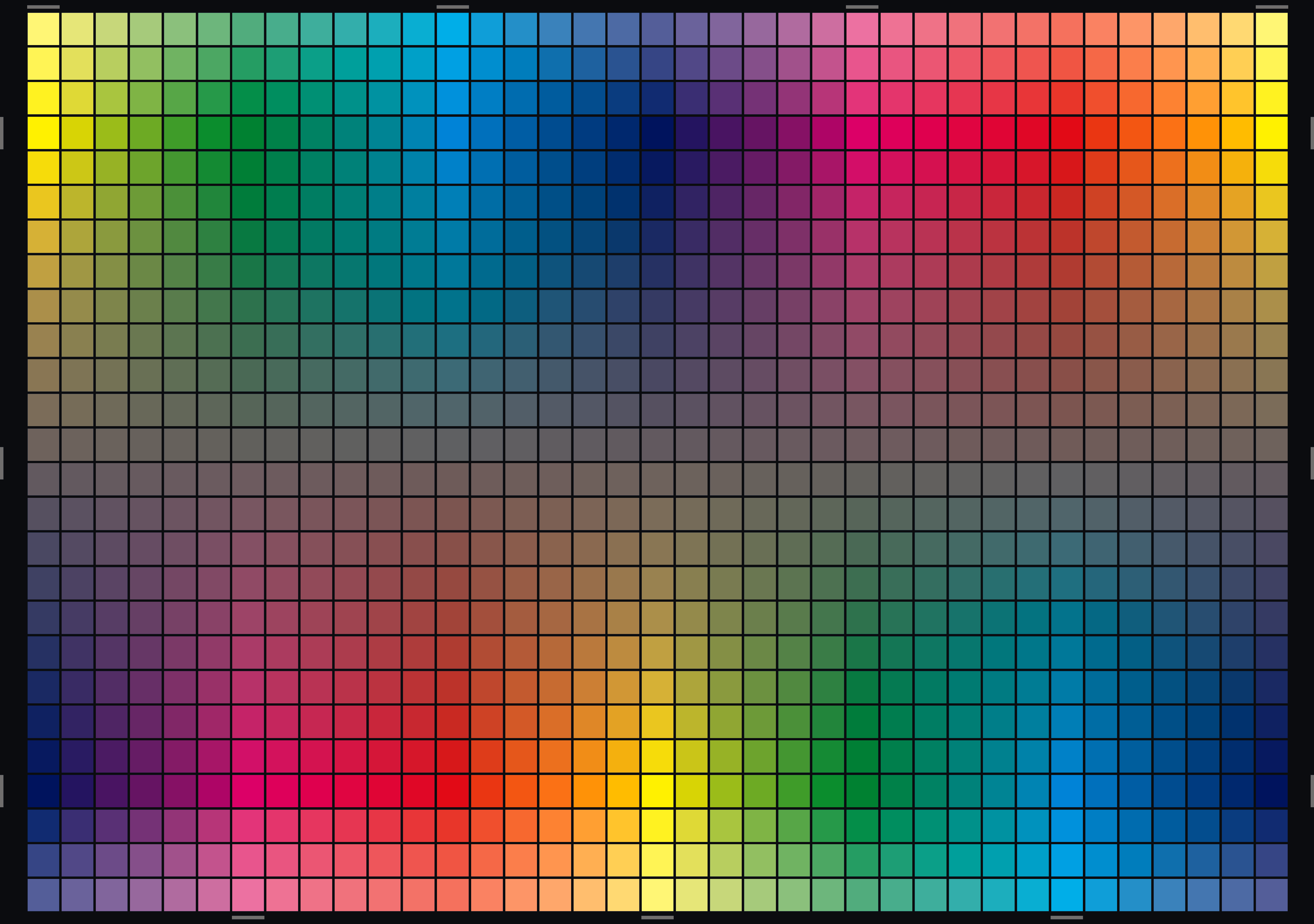
Additional and higher resolution downloads below
Note: These artist’s color wheel files were created in the CMYK colorspace for printing on a CMYK printer: the RGB files are the result of export from CMYK. This may create technical issues in RGB, depending on your usage.[1] For accurate RGB representation, it is recommended to construct your color wheel originating within the RGB gamut. These colors are machine color.
high resolution
abstract
Do yellow and blue make green?
As many a frustrated kindergartener finds out, not exactly. The truth of the physical world does not always conform so neatly to our traditional models, no matter how entrenched those ideas might be. (Spoiler: cyan and yellow make green.)
We will explore one of these models from the art world, the artist’s color wheel — taught through the centuries in the atelier as fact but, like many things passed along through rote tradition, could use a bit of freshening up. The result will be a better way to visualize the relationships between pure colors and will ultimately set us up to build a better color mixing system with pigments.
the problem
Contemporary artists are beginning to challenge the traditional artist’s color wheel, particularly in light of their own personal experience with commercial printing processes.[2] Having seen how it really works with their desktop printer, artists are forced to reconcile the physics of color with the traditional artist color wheel they’ve been taught in art school. Exploring this tension also begins to address the challenges presented by the limitation of pigments themselves — more specifically, the constituent metals and chemicals that give pigment its color.
Our goal, then, is to create a more accurate color wheel theory.[3]
how we got here
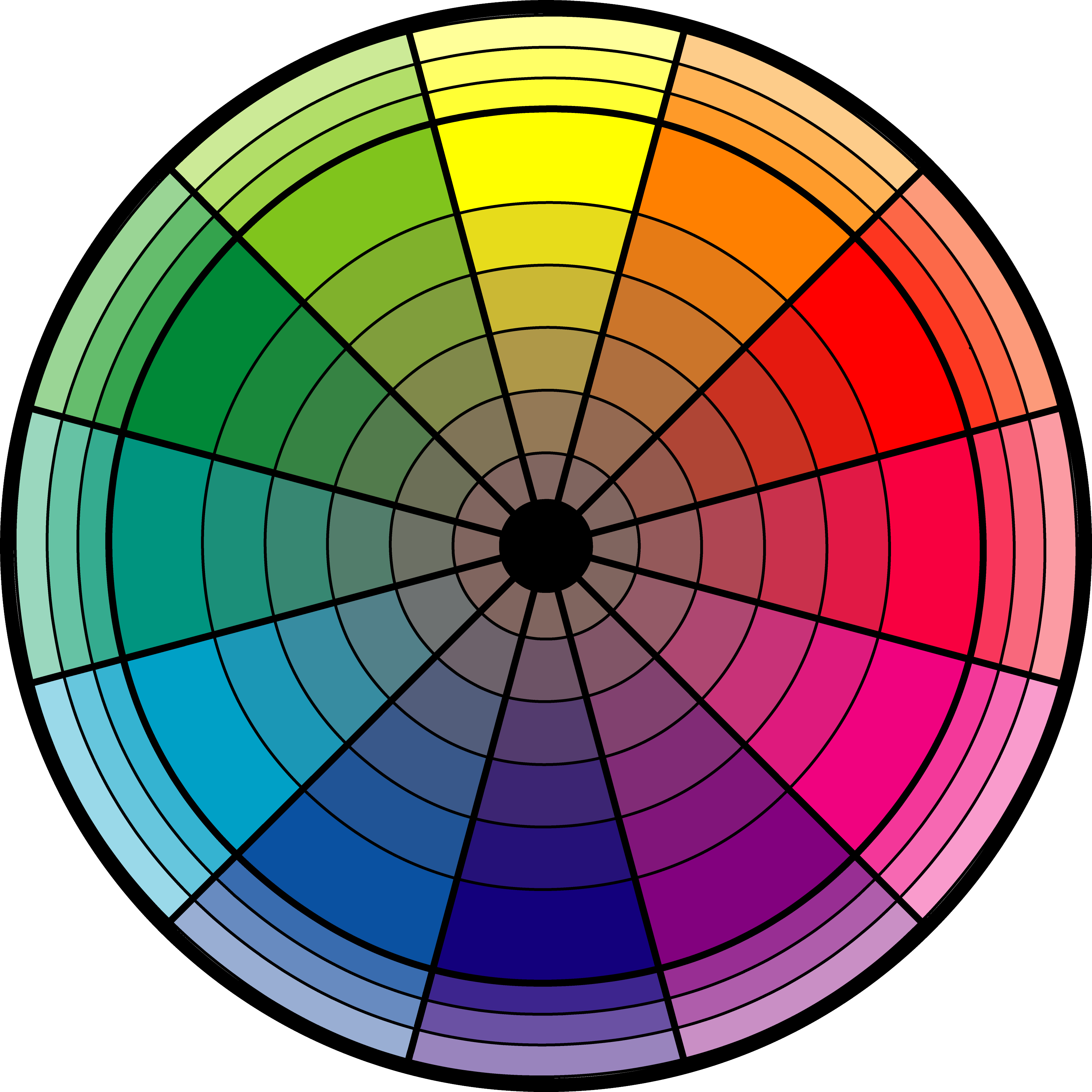
This is the traditional artist’s color wheel, turned into an artwork called Farbkreis by Johannes Itten:

Looks pretty familiar. The traditional color wheel above is not wrong, it’s just missing something. We missed it because, through the centuries, we were looking at the colors on the rainbow instead of all colors that are actually possible. Interestingly, through the study of electromagnetism, some smart physicists figured out that the human eye can actually “see” colors that are not really there. As a result, we see the world differently than we did just decades ago.
This happens in the art world from time to time: the artist finds new ways of seeing things. The painter’s conception of perspective, realism and even color has changed with the changes in perceptions brought by scientific understanding. Think of the Impressionists and their new way perceiving light in a scene. Have you noticed how before the paintings of the Impressionists, outdoor scenes looked, well, like they are happening inside somewhere?
In the pre-Impressionist painting above, we see the philosophy of color as was taught in those old ateliers, at time when artists took their sketches (that they sketched outside) and then came inside and painted in their studio from memory. To “remember” the colors they saw (and achieve it on the canvas) they used color wheel theory from the traditional artist’s color wheel.
But the Impressionist artists, instead, took advantage of a new technology of the time — of pre-mixed paints sold in tubes. They were now able to go outside and paint, not from memory and theory, but from observation. By opening the door of the traditional atelier (literally), and taking the easel outside, the Impressionists discovered new perspectives of how light appears on the surface of objects.

After the Impresionists showed us this new way of seeing things, the old ways of doing things in the atelier, while respected, just could not keep up with how we actually “see” reality.
The traditional color wheel, like the one we saw in the Farbkreis work, is a relic from the time when artists painted in the atelier. It is still taught in art schools today — sometimes as a historical foundation, but sometimes as the way to actually do things. Yet in the same way the Impressionists helped us perceive the light outside in a more accurate way, the traditional color wheel too must yield to a more contemporary understanding of how the human eye perceives what we call color.
what is color?

prisms, electromagnetic spectrum, wavelengths 380 to 750 nm, 790–400 terahertz
via davidsancar
Visual “colors,” as we understand them, are not physical objects on a rainbow per se, but are actually symbols created in our minds as the brain interprets the wavelengths perceived by the photoreceptor cells of the eye. The visible part of the frequencies of wavelengths are detected “out there” in the world and processed by the brain and “mixed” in our mind so that we experience color. Colors, as we perceive them, are interpreted, and our brain relies on interpretation from two sources: the frequency of reflective light and from the frequency of transmissive light.
Here’s the difference between the two:
| Reflective Light | Transmissive Light | |
|---|---|---|
| ☇☇ ☼ | ☼ ➙ | |
| Color Model | subtractive | additive |
| Color Primaries | cyan, magenta and yellow (CMY) |
red, green and blue (RGB) |
| Use Cases | inks on paper; painting on canvas |
projection on screen; images on a computer monitor |
Reflective refers to the aggregate of wavelengths that first bounce off an object before getting to your eye, like the color green of a leaf on a sunny day. Transmissive light, on the other hand, is the wavelength of electromagnetic energy emitted by the source light itself, like the light from the sun before it hits the leaf.
Reflective light follows the subtractive color model: source light (like sunlight) comes in contact with the particles of an object (in this example, a leaf) and some of the wavelengths are absorbed — or subtracted — by the molecular structure of the chlorophyll. The unabsorbed wavelengths are reflected back into the world containing only the frequencies of the visible color that reaches your eye, in this case a shade of “green.” The reflective (subtractive) paradigm is in play when you look at a painting made of pigments: the molecular structures of the various metals in the pigments absorb source light and reflect back the resulting frequencies, appearing in your mind as color.
Transmissive light, however, follows the additive color model: that is, the source light itself emerges from the black nothingness by combining — or adding — color frequencies in proportion to the aggregate of the resulting color. This is happening right now as you look at this computer screen. The brain interprets the frequency of the electromagnetic energy and assigns colors associated with those wavelengths. The projected light is received directly in the eye and perceived by the brain without having bounced off anything.
But is it actually color that you see?
the nonexistence with magenta
The wavelength or frequency of light itself is not color. Even when looking at the visible spectrum — the rainbow — the mind assigns a symbol to represent the wavelength your brain takes in. That symbol is interpreted as color. The wavelengths received in the retina are interpreted by the brain, and the brain “shows” you the experience of color. That is the structure of our world — it’s actually all in our heads.
In fact, when the mind does not have a symbol to associate with a particular wavelength, it just makes one up. A classic example of this is the color magenta. Magenta is not a color on the rainbow. It is an extra-spectral (meaning, not on the spectrum) substitute for a wavelength that the mind thinks should be there, but that does not actually exist in the visible light spectrum. It’s the brain’s attempt to complete a pattern, to close a circle, to connect red on one end of the visible spectrum with violet on the other. It’s a phenomenological construct, created entirely in the mind, which helpfully puts something “out there” when it does not know how to interpret the data coming in.[4]

Can you see this?
prisms, electromagnetic spectrum, wavelengths 380 to 750 nm, 790–400 terahertz
via davidsancar
There are metaphysical ramifications of all of this — of the brain making things up that are not really there — but for artists the important part is that magenta “exists.” That’s because it’s the missing piece of the visible color spectrum that the traditional color wheel does not take into account.
And, interestingly, it is done like this:

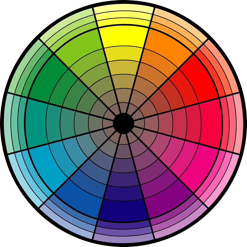
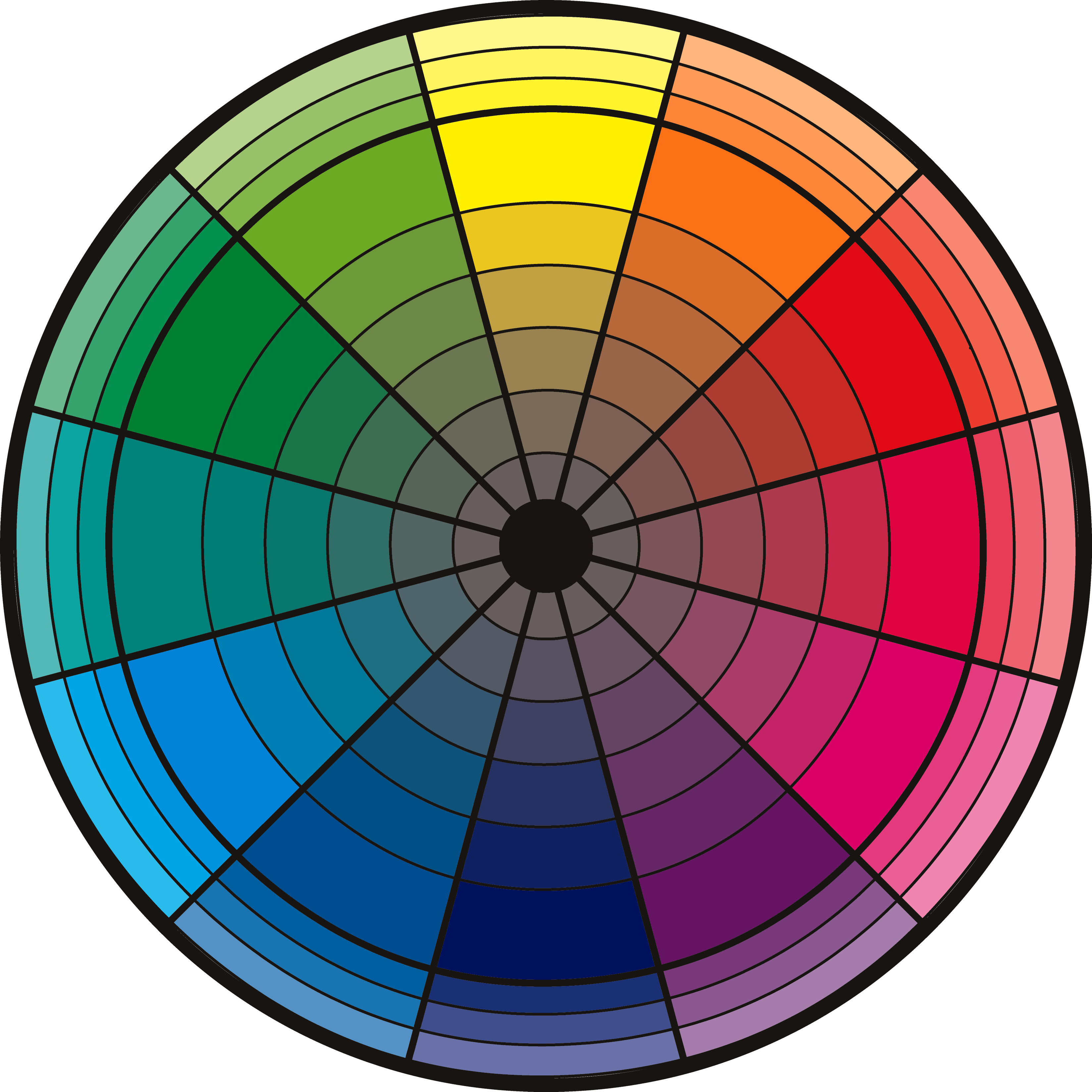
the CMY/RBG color wheel
The outer colors of the above projection are the three primary colors of the additive color model: red, green and blue (RGB). As transmissive attributes of color, these primaries are used in contemporary projection techniques (such as television and computer monitors), as light projecting from a black-screen source to produce the illusion of the full color spectrum through in-retina visual mixing. All colors “seen” by the brain are actually proportional amounts of red, green and blue to simulate the other colors (orange, purple, etc).
As seen in the image above, when the RGB primaries are projected on a white screen, a curious thing happens: the secondary colors produced by the projection are cyan, magenta and yellow (CMY). These are exactly the three primary colors of the subtractive color model.[5] Thanks to the work of the physicist James Clerk Maxwell, we know that CMY is a much better arbiter of true color mixing than the primary colors of red, blue and yellow of the traditional color wheel. CMY produces more accurate and predictable color mixing results with inks on white paper.
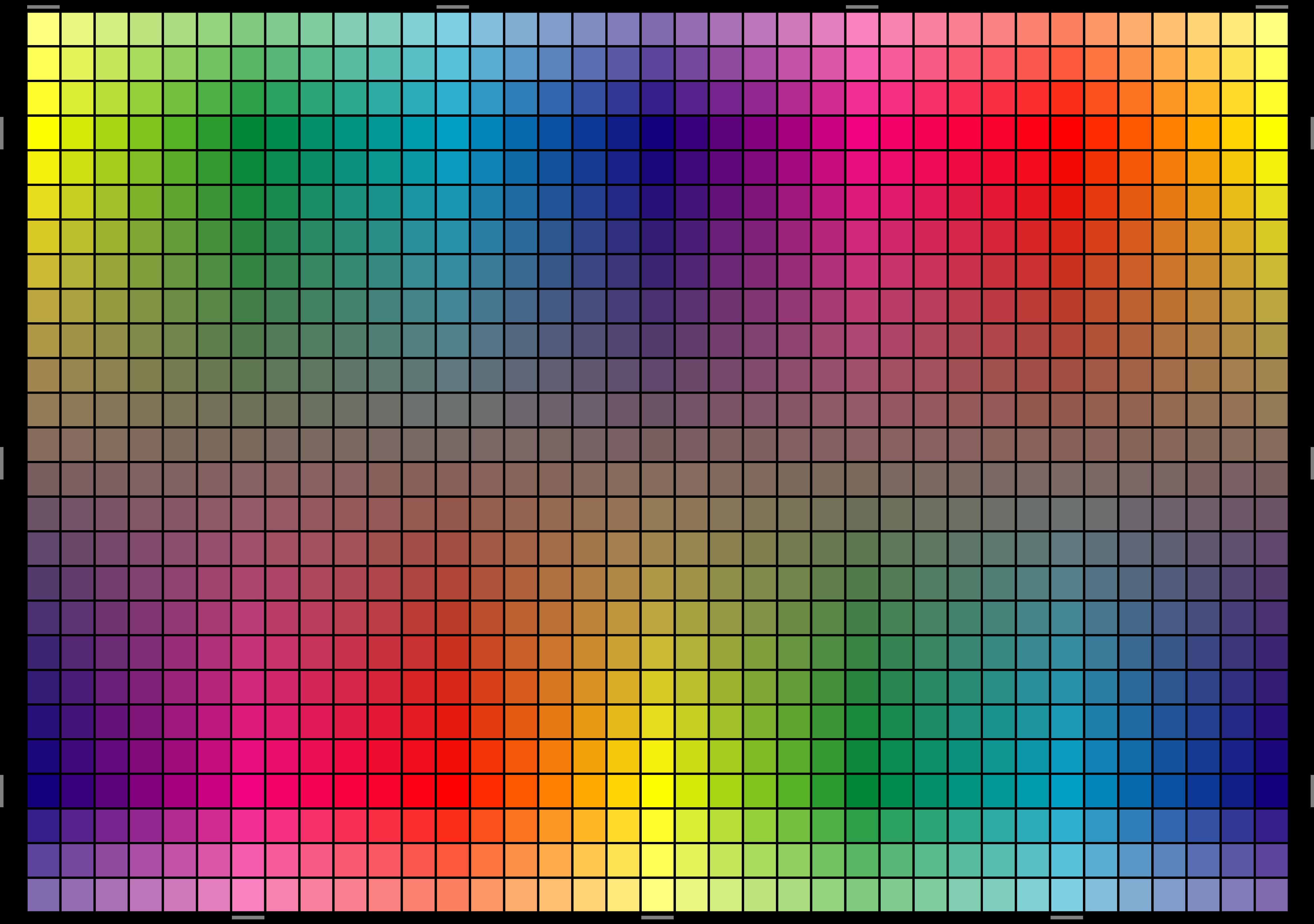
So our contemporary visual color wheel could combine these two primary models into one. Magenta, which doesn’t exist on the rainbow (and therefore is not on the traditional color wheel), is perfectly comfortable sitting there in the CMY colorspace, so by bringing it into our new color wheel, magenta becomes a sort of “unified field” that reconciles the two paradigms of color and wavelength, between the additive and subtractive. We take each primary from the CMY and RGB paradigms and place them in equidistant spots on the wheel, and to complete the circuit, the secondary colors that are created by the visual mixing of the six primary colors, in equal proportion, fill out in the remaining six spaces of a 12-slice pie.
all together now
The CMY/RGB color wheel (and its correlating grid) gives us more accurate color complements and represents a good visual model for studying the hue, value and balance of color — of pure color. That’s an important distinction because the colors represented on our new wheel have their genesis in the transmissive light scale, from the additive model, from which the reflective primaries emerge.
In practice, too, it works. This CMY/RGB color wheel improves greatly upon the traditional artist’s color wheel in determining color relationships, and serves admirably as a more stable foundation for mixing paints. For example, on the old traditional color wheel, the color green is made by mixing blue and yellow — which does not exactly work in the real world. On our new color wheel, though, mixing cyan and yellow makes green, which does work.
the end
(or, the next step)
Science doesn’t usually give final answers, but upon discovery reveals new areas to explore. So with the knowledge we have now, we can take things a step further. We can be even more precise. For mixing pigments in the physical world we need to find the pigment color equivalents of these pure colors (from the additive model), and find the complements (or opposites) of the pigments that can be mixed to create all the colors in between. Because physical pigments (representing the subtractive model) are not pure colors.[6]
To start with, green in the physical domain of pigments is actually a secondary color, created (accurately) by mixing cyan and yellow from our new color wheel. So there would be a difference between this 12-color CMY/RGB pure color color wheel, and a new theoretical mixing color system that represents (and is created by) pigments. Our pigment mixing system would then have 10 colors, instead of 12 — 5 primaries and 5 secondaries.
Perhaps the next step would be to make the jump from the traditional 12-color color wheel to a 10-color mixing grid.
I have found one additional source investigating this new approach to pigments. There is a color mixing system created by the paint manufacturer Lascaux⎋ that’s built on a 5-color primary model, and includes red and blue from the RGB colorspace, and cyan, magenta and yellow from the CMY.[7] They have some color exercises in their product literature, with some starter ratios for common or popular colors, but at the time of this writing, their literature does not go the distance as far as creating a mixing wheel. I have created some preliminary mixing results from their system, though. And, in addition to Lascaux, I’ve also noticed that some other paint manufacturers are beginning to match their own pigment spectrums to align with the magenta color wheel (though not with a 5-color primary system like Lascaux). As a result, I’ve listed some of the brands in a separate comparison chart.
color mixing Using the Lascaux Sirius primary color system to explore the concepts of 10-color subtractive color mixing.
acrylic colors Some notes I took while researching the constituent elements of various pigments in acrylic paint.
Posted December 14, 2015